
What I’m going to do is post twice about the same exhibition, once from the perspective of exhibition design for Design Competition, and another from the research-centered eye required for our first Ellipsis studio project. This will be the former.
For Design Competition we were put into groups and had to choose an exhibition to go to, and essentially look at how the exhibition communicates. Things to consider were the elements that made up the exhibitions identity (typeface, colours, graphic elements) and the way it worked (it’s design in physical space, the way it moved you around its space).
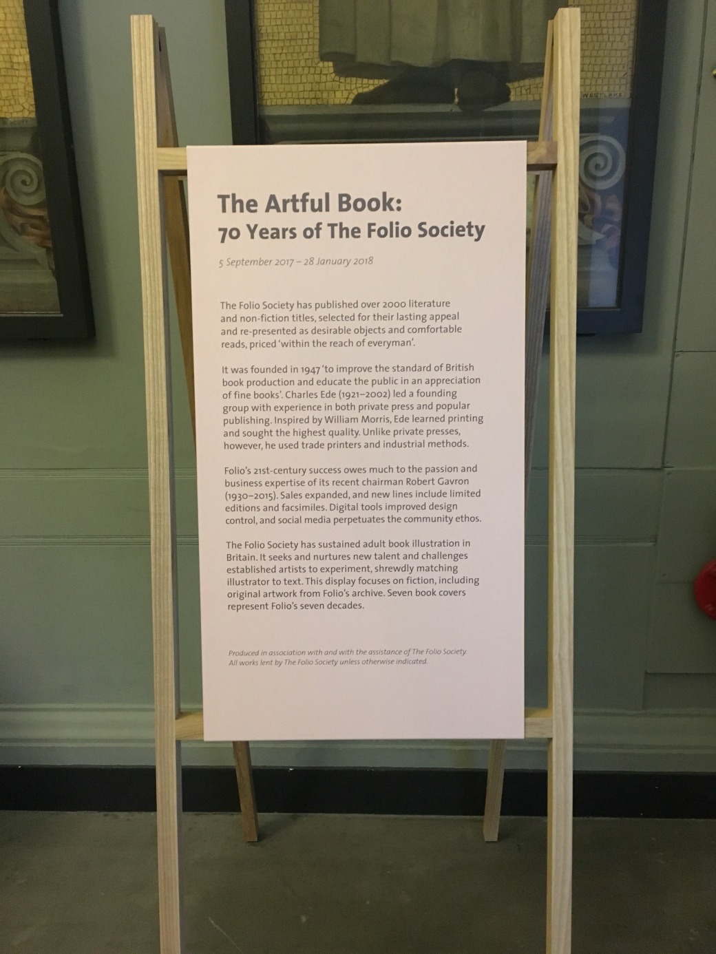
The exhibition we as a group decided to go to is called The Artful Book: 70 Years of The Folio Society. This was an exhibition we saw in the suggested research materials section of the first Studio Ellipsis brief but also one we were interested in for both Studio and Design Competition reasons (it dealt with published works and the way they were then displayed in an exhibition).
The Folio Society was founded in London in 1947 with the intention of ‘improving the standard of British book production and educate the public in an appreciation of fine books’. This exhibition then was a collection of their work since their inception.

Trying to find the exhibition space was a bit of a problem unfortunately, as the museum is so big and houses so many different exhibitions at any one time that you have to specifically be looking for the one you want to go to so as not to get sidetracked. After asking at the Information table, the woman trying to help me had the same problem. The exhibition was supposed to be in ‘exhibition space 85’, but after consulting the map, 85 was missing. It took her a minute to deduce that the space must be the landing for the National Art Library, so off I went and the space was pretty much just the landing.
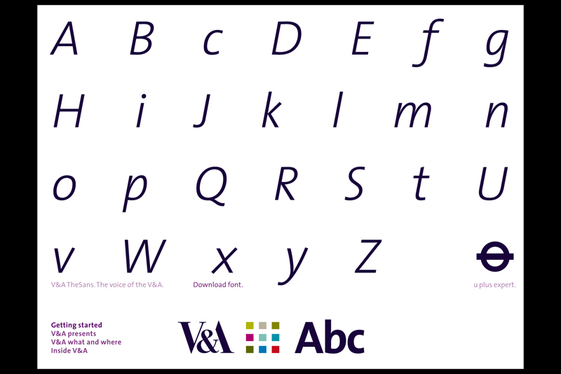
As part of the wider Victoria & Albert Museum space, this exhibition retained much of the distinguishing elements that make up the V&As visual identity. The typeface for the exhibition captions and informative texts is the ‘V&A Sans’, a custom variant of the Thesis Sans typeface and designed for the museum in 2002 as part of its brand update. The typeface is presented heavy for the titular sections, light and italic for the exhibition dates and then regular for the paragraph texts that talk about the exhibition itself.
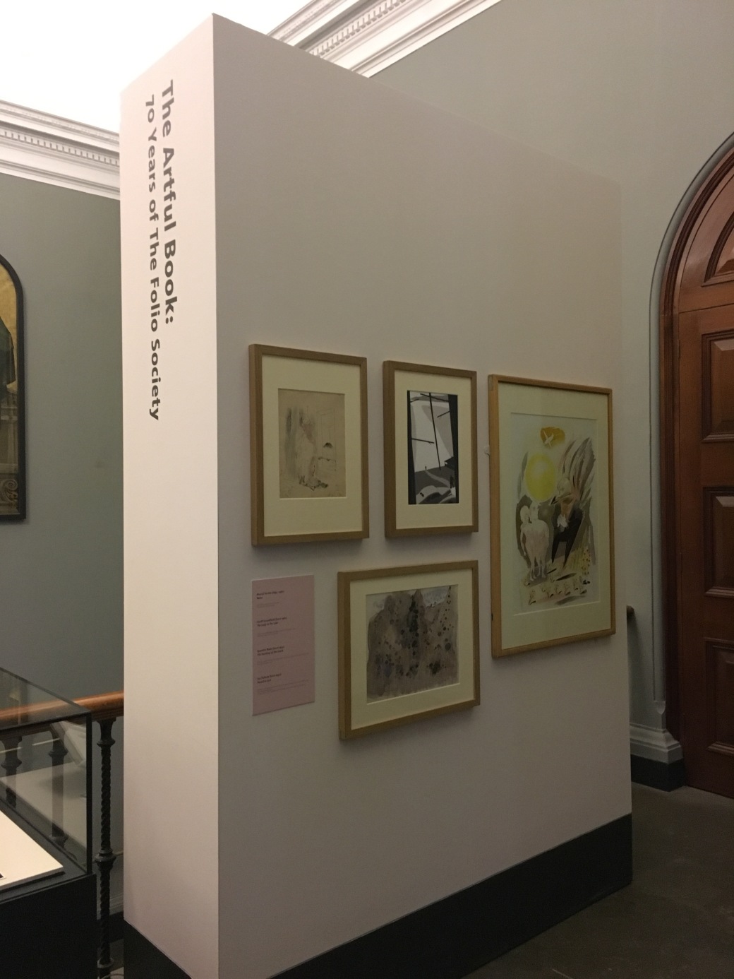
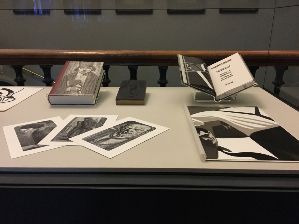
There were no hand-outs for the exhibition, which is understandable when you see it and how small it is. A mixture of glass display areas and a big white wall for hanging frames was used to exhibit the various works throughout. The captions for the works displayed occupy the extreme left of the glass-covered cabinets, with various smaller complimentary captions displayed below the different works.

In terms of movement, well… you pretty much walk in, go to the end of it and have to come back, as the National Art Library is closed on Sundays and so the exhibition doesn’t lead anywhere but back out. There are also a couple of benches placed along the introductory exhibition caption, but they seem to mainly be there for people to rest at rather than for admiring the work while sitting down on them.
A combination of sketches and rough drafts from various renowned artists along with the publications the illustrations appear in where shown, and all in all it’s a good introduction to the Folio Society, what they’ve aimed to do and what they have done in 70 years of existence.


One thought on “Design Competition: The Artful Book at the V&A”